

Semantic colors
Signicat Semantic Tokens in FigmaFor every exposed name, sample, and copyable variable, see Color tokens.
Semantic color tokens are the cornerstone of our UI's visual language. They bridge the gap between primitive color values (e.g., blue-400) and their intended purpose, ensuring a cohesive, consistent, and accessible user experience. By naming colors based on their function, we create a system that is logical, maintainable, and enables us to build a harmonious set of components. These tokens are not component-specific; they are generic and applied based on the use of the color.
Naming convention
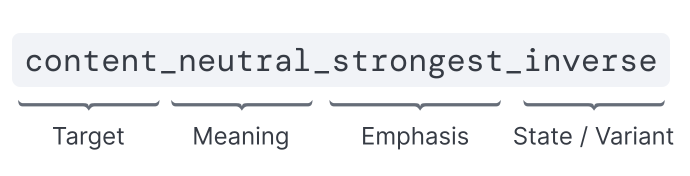 To define our semantic token names, we follow a structured, layered formula. This multi-part name describes precisely what the color does, where it's used, and how it behaves. The general structure is:
 - Target: Background, border, and content
- (For content tokens only) "On" prefix: If content is displayed on a strong bqackground, then an "on" prefix is used.
- Meaning: Primary, secondary, neutral, disabled, success, danger, info and warning
- Emphasis: Strong, stronger, and strongest. Subtle, subtler, and subtlest
- Variations: Variant, inverse, and backdrop
- State: Hover, pressed, and focus
Meaning of Color
In Catnip, colors serves a purpose and hence a meaning attached to it. However, in Catnip, we do not use only color to convey meaning. The use of graphics and UI changes are used to remain accessibile. More on that will be covered specifically in each component.
Primary
Primary colors are the most prominent attention-seekers within the UI. Used sparingly, they infuse the interface with the brand identity and make key elements pop without overwhelming the user. These tokens also facilitate seamless switching between the Signicat and EndUI themes.
Neutral
Neutral colors are the most frequently used tokens in Catnip. We utilize a steel grey which has a subtle bluish undertone for our neutral palette. Variations within this set establish visual hierarchy, elevation, and clear distinction through contrast rather than hue.
Disabled
Disabled tokens utilize a pure, undertone-free grey to indicate inactive states. They intentionally reduce the contrast between background and content to signal that an element is not interactive. The lack of an undertone ensures a visual distinction from standard Neutral tokens.
Info
Info tokens are used for elements that highlight helpful information, neutral updates, or general guidance for the user.
Success
Success tokens communicate positive outcomes, such as completed actions, successful state changes, and confirmation badges.
Danger
Danger tokens highlight destructive actions, errors, or critical alerts, such as missed input fields or system failures.
Warning
Warning tokens draw attention to important, potentially risky situations that require user awareness. They are more urgent than "Info" tokens but do not represent a hard error or failure like "Danger" tokens.
Color Application
Catnip defines all colors tokens to be applied to 3 main categories: Background, Border and Content.
Background
Any color that is applied to fill an area that is not text or icons will use a background token. Examples include: screen background color, button fill color, backdrop color, modal background color, etc.
Content
Content refers to elements that convey meaning via text or graphics. Examples include, texts and icons.
Border
Any color applied as strokes and outlines are refered to as borders. Examples includes, focus state outlines, table row dividers, secondary button border, etc.
Light and Dark themes
The same semantic names are used in both themes. Light values are on :root in default CSS; dark overrides ship in @signicat/catnip-design-tokens/css/dark and apply under [data-theme='dark'] (see Theming). Chart data colors are defined for both themes: defaults in the light semantic file and mode-specific values in the dark semantic file.
Color Combinations
This section outlines the rules for combining background and content tokens to guarantee sufficient contrast and maintain a consistent, accessible interface. Following these guidelines is crucial for a predictable user experience.
Pairing by Meaning
When using a background token with a specific meaning (e.g., primary, danger, success), you must pair it with a content token of the same meaning. This ensures that the color relationship is logical and consistent.
- Correct: Use
content-info-strongon abackground-info-subtlesurface. - Incorrect: Do not mix meanings, such as placing
content-warning-strongon abackground-info-subtlesurface.

Pairing with Subtle Backgrounds
Background tokens with a subtle, subtler, or subtlest emphasis are designed to be paired with content tokens that have a strong, stronger, or strongest emphasis. This pairing creates the necessary contrast for readability.
- Correct: Use
content-success-strongon abackground-success-subtlesurface. - Incorrect: Do not mix and match, such as using
content-success-strong-inverseonbackground-success-subtle.

Pairing with Strong Backgrounds
Conversely, background tokens with a strong, stronger, or strongest emphasis must only be paired with their corresponding content-on-... tokens. These special "on" tokens are specifically designed to provide accessible contrast against dark or vibrant backgrounds.
- Correct: Use
content-on-primaryon abackground-primary-strongsurface. - Incorrect: Do not mix and match, such as using
content-on-warningonbackground-primary-strong.

Request a new semantic color token
Are the existing semantic tokens not enough to meet your needs? Then please reach out to our design system team on our #catnip slack channel or go to the Jira Product Experience board and create a "design" ticket with the label "Catnip".